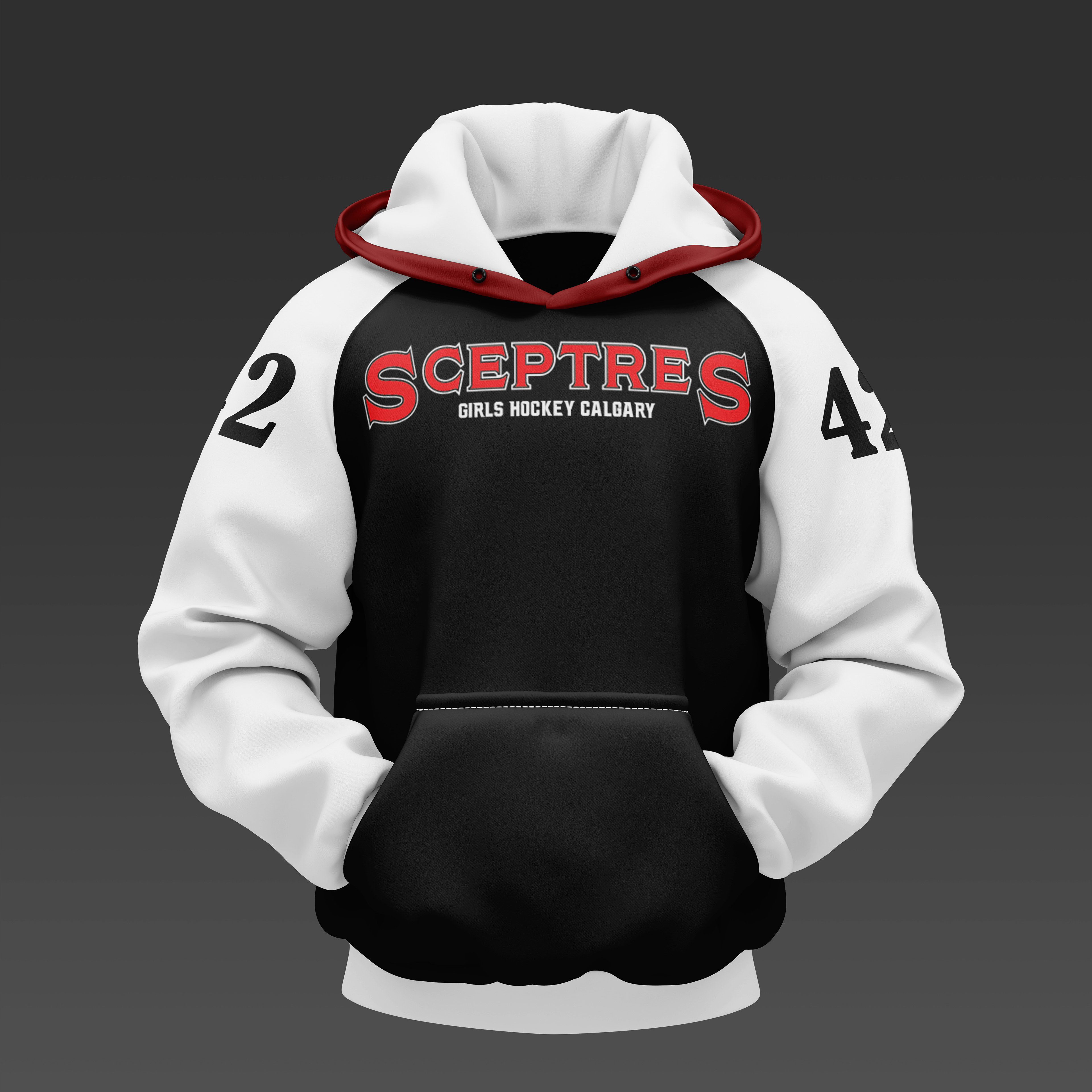

For this project, I revisited the Sceptres logo I designed for a youth girls' hockey team in Calgary. The original logo was a simple black-and-white illustration, created to meet the client's request for a straightforward, colorless design. However, to make the logo more bold and dynamic, I refreshed it using a mix of the Girls Hockey Calgary (GHC) logo colors and the red and white from Canada's official flag. The final version primarily uses red and white with a small black outline for added depth and contrast.
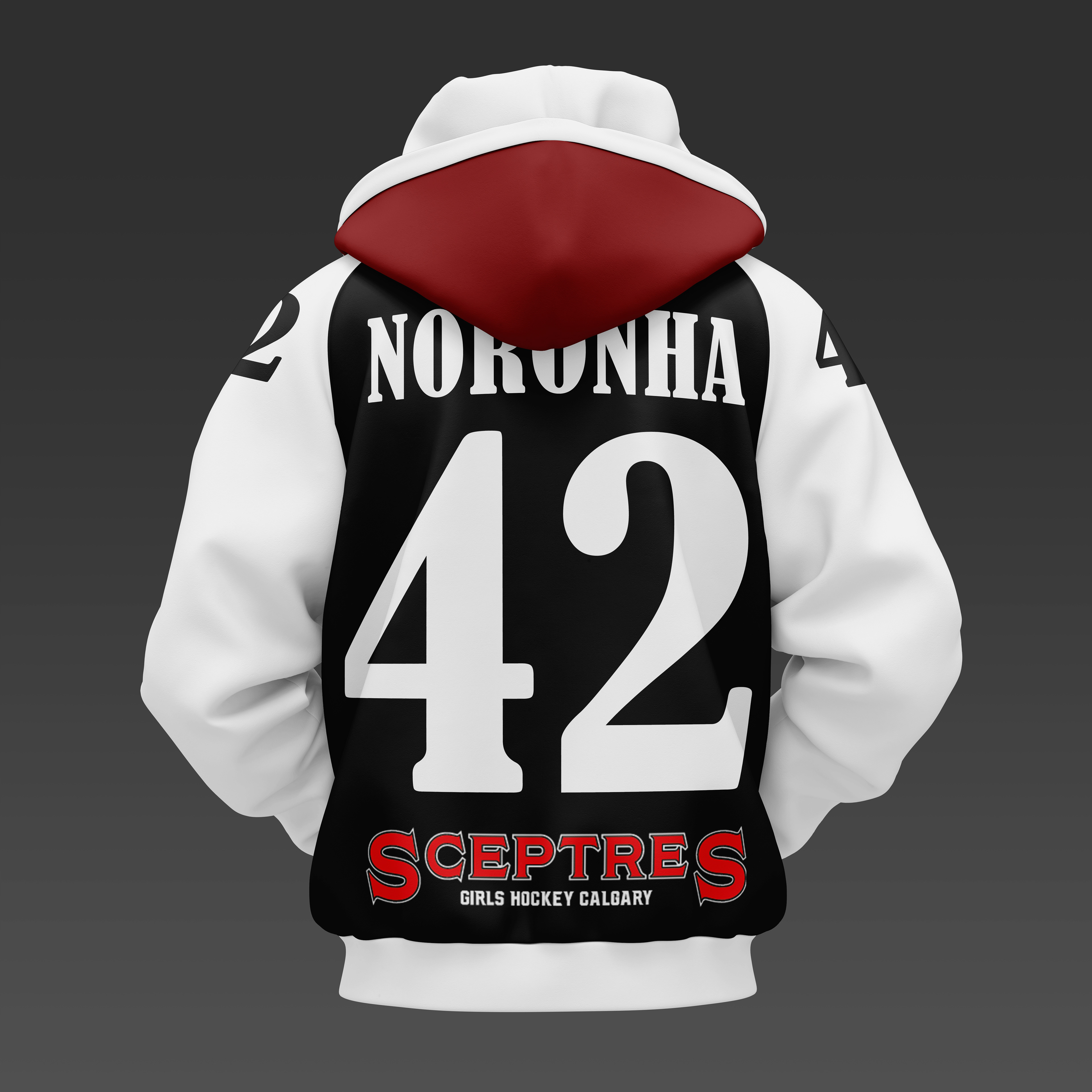
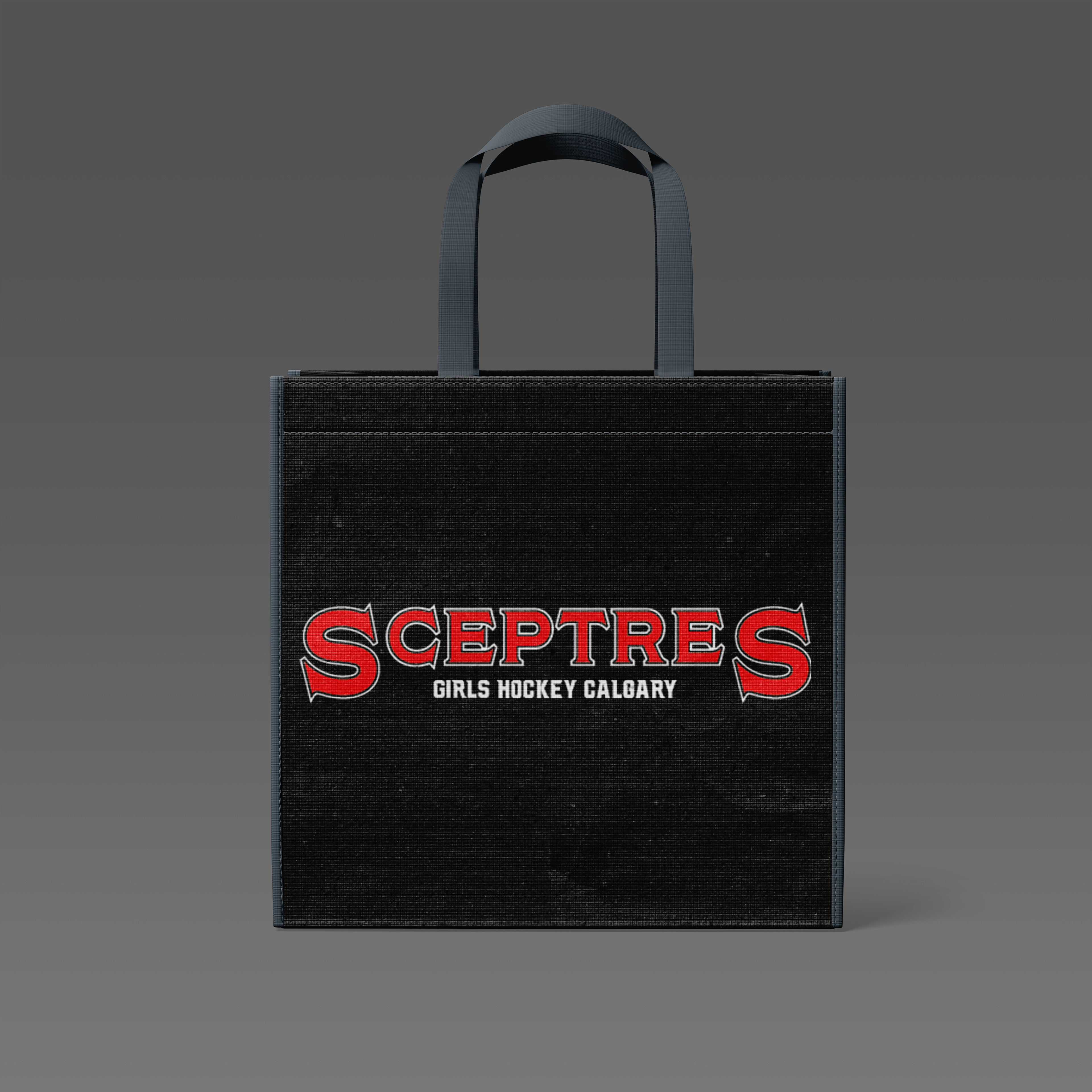
To showcase the updated logo, I applied it to a hoodie mock-up featuring the logo on the front, the player's name and jersey number on the back, and the refreshed logo at the bottom. The hoodie itself follows a color scheme inspired by the Team Canada National Hockey Jersey, using more black for contrast. Additionally, I created a black tote bag mock-up that only features the new logo. This design choice makes the tote less personalized, appealing to supporters of the team who may not want to represent a specific player. The overall goal was to create a more striking, versatile, and marketable identity for the Sceptres.